The Kitten's Cradle
Website Redesign
Research - Wire-framing - Prototyping
Usability Testing - UI Elements
The Process
Background
Redesigning the website of a nonprofit organization called The Kitten’s Cradle.
Tools Used
Adobe Illustrator, Figma, Figjam, Google Suite, Miro, DoveTail, Zoom
Research
The Problem
We observed that The Kitten’s Cradle’s website lacks the clarity of showcasing the cats available for adoption, which is causing users to leave our site, which ultimately leads to more stray cats without a home.
The Solution
A redesign of the website which will connect people who are seeking to adopt to The Kitten’s Cradle website to successfully bringing a cat in need to their forever home.
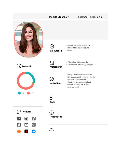
Proto persona
We began our research by creating a proto persona, reaching out to the cat organization, and our research plan.
Stakeholder Survey
We interviewed Tonya, the Outreach and Engagement Coordinator.
-
responsible for communications and social media
Top priorities for the organization:
-
Finding sustaining funders (grants or recurring donations)
-
Placing cats into safe and loving homes
Organization’s message: Welcoming, trustworthy and connected to their cause
Things to change about website: Accessibility and clarity
*She stated that less than or about 25% of people who came to adopt through the organization came from their website. This shows how low their website traffic reach is.
Survey
91%
have never fostered a cat before
76%
aren't looking for a specific breed
83%
have adopted a cat before
In our research plan, we established several questions.
-
What barriers do users face when researching how to adopt cats?
-
Have they ever adopted or fostered a cat?
-
What are people’s concerns when looking for where to adopt cats from?
-
What are the deciding factors of adopting a cat?
We conducted a survey using Google Forms and we received 42 responses.
Key points from our surveys are…
-
83% have adopted a cat before
-
91% have never fostered a cat before
-
76% aren’t looking for a specific breed when adopting
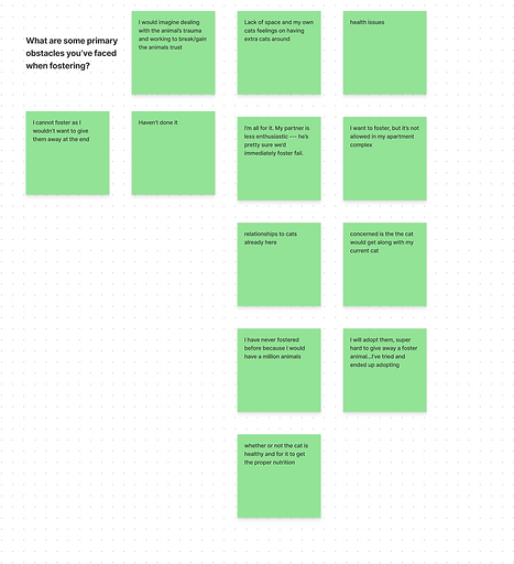
User Interviews
Key sentiments from our user interviews are:
-
“Sociable cats who can be alone while I am at work.”
-
“Calm - snuggly - an overall low key kitty!”
-
“Calm but fun, will integrate into my family and with other cats if I decide to get more.”
-
“Special bond and extra fuzzy.”
We conducted five Zoom and phone interviews the week of March 6th to March 12th, 2023.
Our goal was to understand people’s reasoning behind adopting cats and their thought process behind it.
-
“Transparency from the adoption agency providing all info they have on the kitty,”
-
“Are they litter box trained and/or do they have any medical conditions?”
-
“Too many animals are killed by orgs like Humane Society, I'd like to give those cats a chance”
-
“Give them a home environment instead of a shelter”
Affinity Diagram

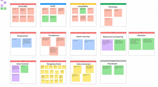
To organize the data from our user interviews we used an affinity diagram.

People looking to adopt a cat are seeking websites that are easily searchable and will provide sufficient information, such as which cats are available to adopt, what their personality is and/or age is in order to help them successfully find a cat in need of a forever home. When looking through adoption websites, it can be difficult to navigate, causing users to be frustrated throughout the process.
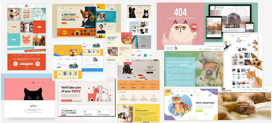
Competitor Analysis


During our competitor analysis, we looked at Feline Rescue, Kitty Revolution, PetSmart and Petco. Our main takeaways were there were several rescues in the Twin Cities but only a handful of no-kill cat specific rescues. The majority of them were poorly designed. Kitty Revolution was a standout, we were actually quite surprised that it was a local rescue. Typically rescues are volunteer and operated through donations. We also understood that the design isn’t always at the forefront for adoption websites as finding homes and safe havens for the animals are the top priority. After talking to our stakeholder, accessibility and clarity was the top priority so we knew that was what our focus was.
User Persona
Our team created a User Persona to gain a better understanding of our user, Sydney Miller.

Storyboard
Sarah is a first-time, prospective cat owner who is excited yet nervous about adopting a new kitty. She wants the cat to thrive in her environment, but is having trouble deciding the characteristics that she would prefer for her cat to have. Sarah assumes cats are lower maintenance and more self-sufficient, which is helpful because she has a busy job that keeps her from the home for most of the day. When Sarah is home, she wants a cat that will engage with her and and be friendly, while also making sure she doesn’t have to upend her life for a new pet.

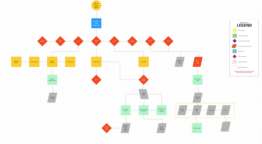
User Flow
The user flow followed a step by step process of how a user would find the site using a search engine and the corresponding navigation bar and menu items. During research and feedback, our stakeholder mentioned that the key components of the organization’s website was continuing to focus on accessibility and clarity. The navigation prior to the redesign was fairly simple, though there were a couple of instances that could possibly raise accessibility concerns. For one, the drop down in some cases was quite a distance away and seemed confusing and buggy.
During several iterations, providing clarity continued to be our focus during the redesign. After multiple runs of mid-fidelity testing, we asked our testers to complete three specific tasks that focused on ease or difficulty to locate: the adoption page, make a donation, and contact the organization.
With our tester feedback in mind, our sitemap evolved to reflect those updates, providing a clear path with each tap or mouse click.
Wireframes
Lo-fi prototypes


Mid-fi prototypes


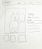
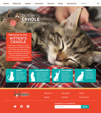
In our early ideation, we wanted the user to know the site was a cat rescue site and there were cats available to adopt vs the old site, where you didn’t actually find the available cats unless you scrolled down. The first three photos on the site, it was hard to tell if they were actual cats available.


Usability Testing
We conducted three user tests, with the feedback we got it gave us a better insight on what components worked and helped us iterate our designs to be more concise and intuitive.


-
Objective 1: To test if a user can successfully submit a cat adoption application.
-
Objective 2: To test if a user can successfully make a donation by finding the donation button.
-
Objective 3: To test if a user can contact the organization.

We added a logo and adjusted the menu bar. We also added a footer allowing users to find info on the menu or the bottom of the page. We made the “adopt”, “available cats”, etc. buttons bigger.
We changed the layout of the application, adding a picture to make better use of the white space. We also fixed the spacing between information bars. Changed the placement of the submit button to make the flow better when filling out information.
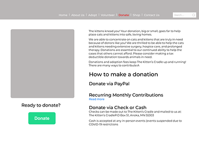
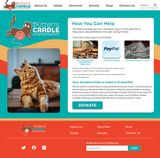
We changed the layout of the donation by sectioning the information on how to donate making it easier and less overwhelming for users to read. We also added pictures showing users different ways to donate. We changed the placement of the donate button so users' eyes will follow the flow when reading.
Moodboard
Through our moodboards and color choices, we chose a color palette that was warm and inviting.
Using Pinterest, adobe color, Dribbble and Flowbase we collected images and color templates to decide how we wanted our website to look.


Hi-fi prototypes
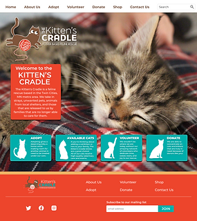
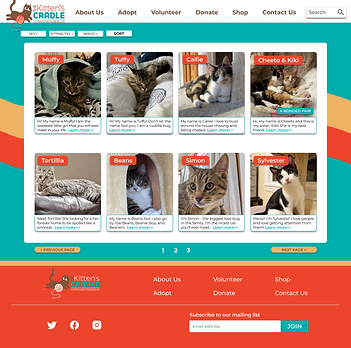
After analyzing our results, one of the first solutions we wanted to tackle was limiting the vertical scroll on the desktop, so users browse paths to adopt, discover which cats are available for adoption, learn ways to volunteer and make donations. By including a more playful color palette–compared to the site’s current fairly sterile experience–brings in a bit more fun. We also created a more personalized profile landing page to further introduce potential owners with cats of all ages, including pairs.

Moodboard
Using pinterest, adobe color, Dribbble and Flowbase we collected images and color templates to decide how we wanted our website to look.
Before & After


The first solutions needed to tackle was
-
limiting the vertical scroll on desktop
-
the browsing paths to adopt
-
discover which cats are available for adoption
-
learn ways to volunteer and making donations
By including a more playful color palette–compared to the site’s current fairly sterile experience–brings in a bit more fun. We also created a more personalized profile landing page to further introduce potential owners with cats of all of ages, including pairs.
Conclusion
Given more time, we would’ve liked to expand the website more. There were some pages we weren’t able to create such as the volunteer or merch page. We struggled with our design choices and making sure small details were cohesive within the site. We also learned more about what UI components we should focus on such as if we needed a footer on our page or not. Our next steps would be expanding the pages allowing users to scroll down the site.